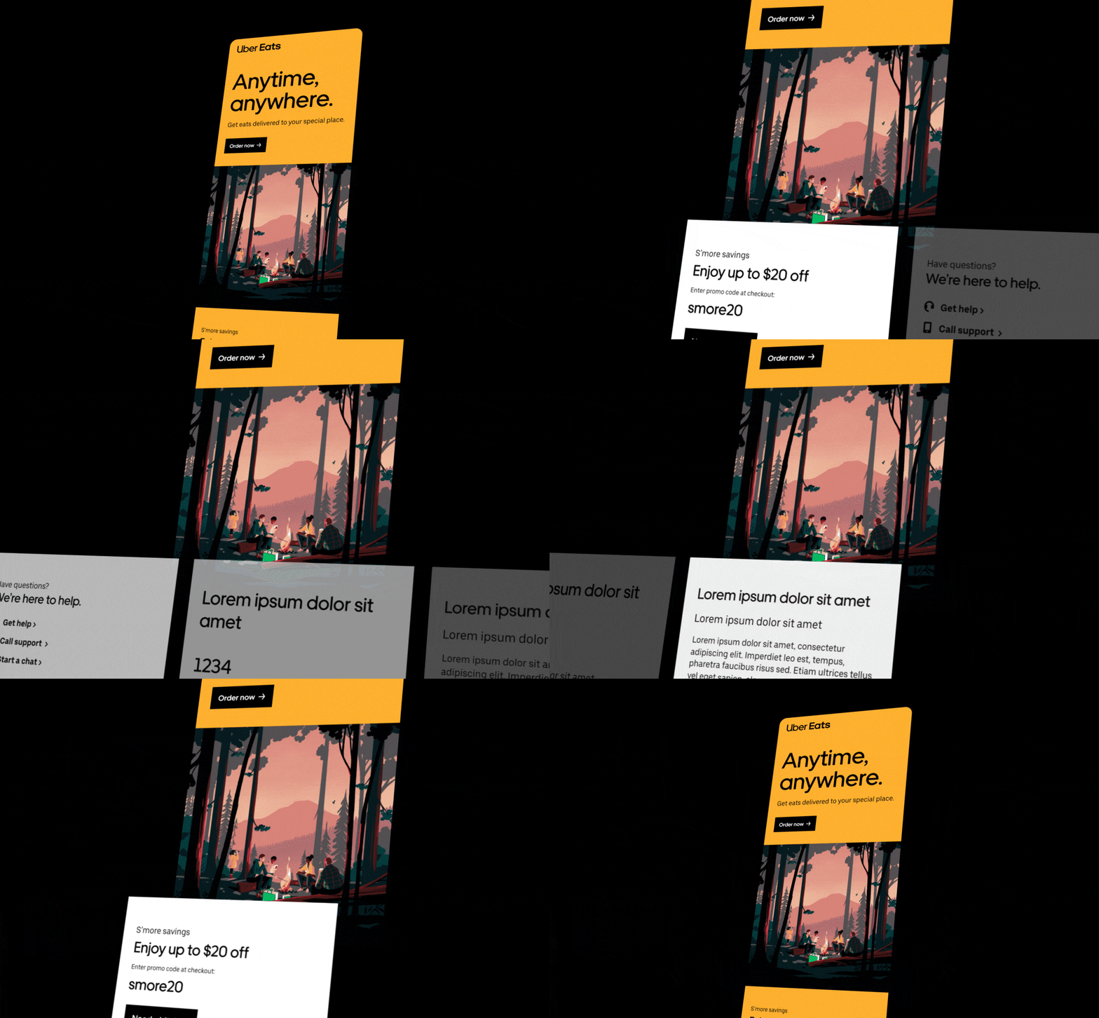
Branding Uber's CRM System
JUNE 2022 - AUG 2022
ROLE: DIGITAL, PRODUCT, SYSTEMS DESIGNER
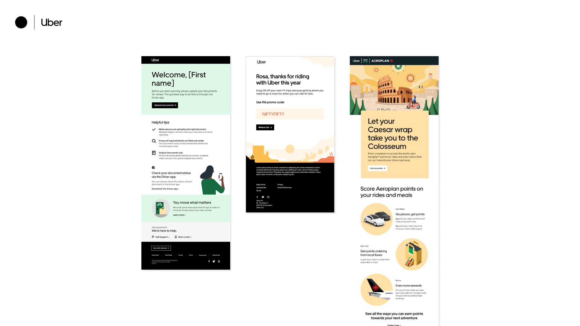
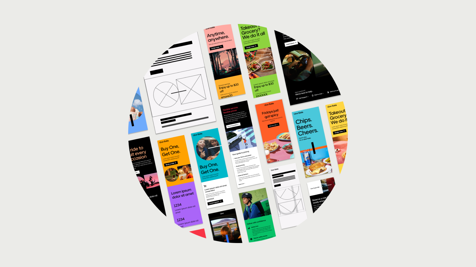
In 2022, Uber went through a rebranding. Collaborating with brand, product, and devs, I was tasked with applying that brand into Uber's current CRM system, with a focus on the color palette. The result was a series of modules that were used in the self-serve design of emails.
Identifying
Scope
How should we approach the task?

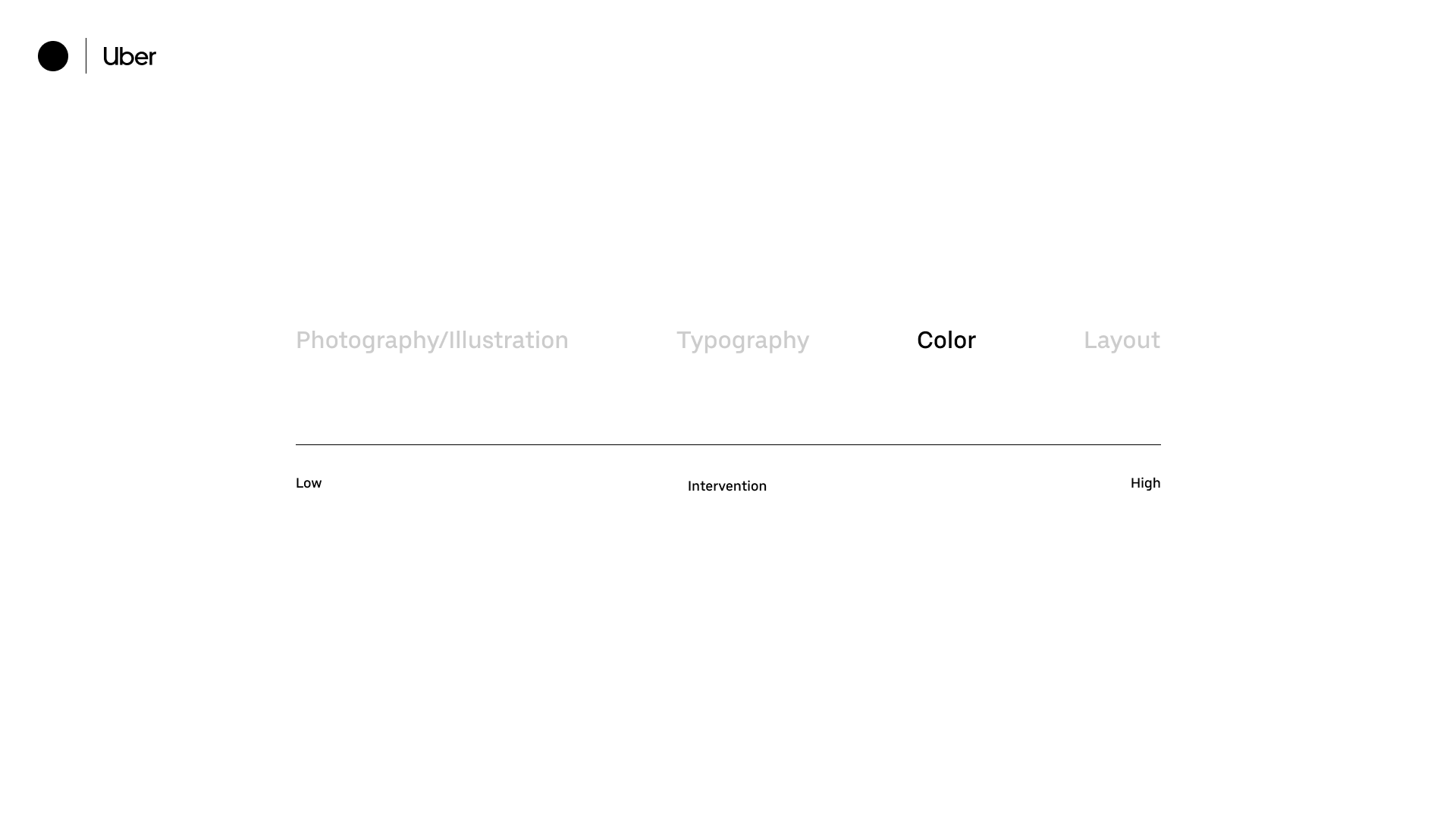
Levels of Intervention
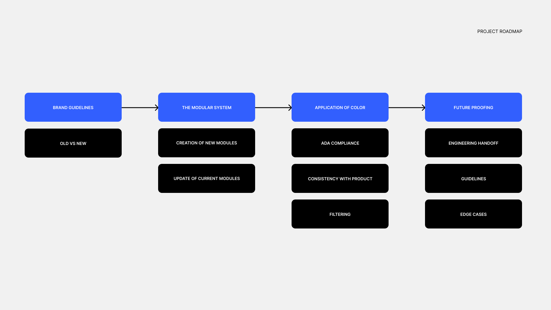
Implementation of a new color palette was relatively high-intervention when it came to designing for a self-serve system. Identifying this led to the project's roadmap for execution.
The Brand
Refresh: Color
Out with the old, in with the new.

Diverging Channels
The new palette accounted for Uber's new business model that shifted from a taxi service to a transportation ecosystem. With new lines of businesses, applications of the palette had to be differentiated in order to fulfill multiple use cases/contexts. We specifically focused on Uber Eats (delivery) and Uber Rides (mobility).
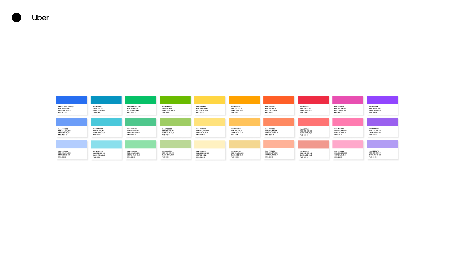
Old Palette:
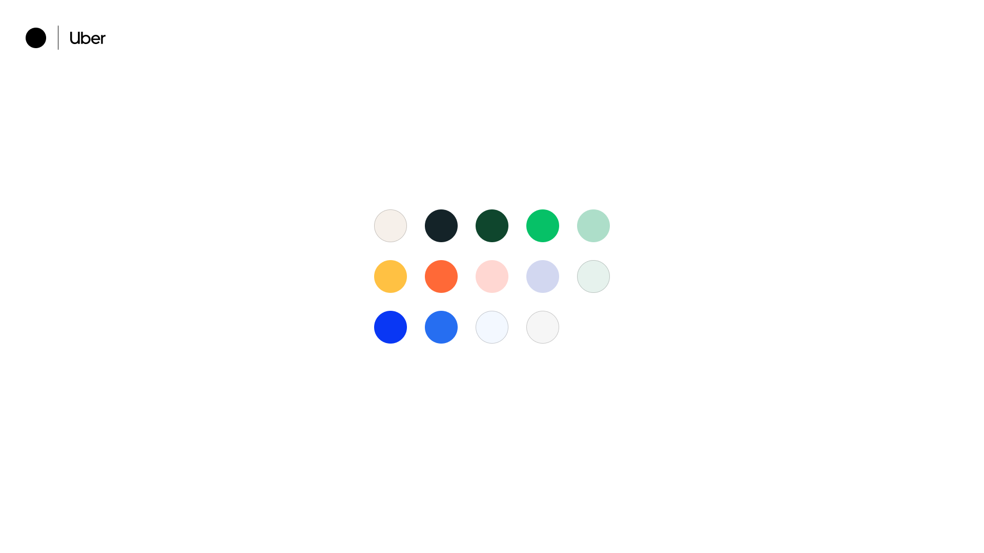
New Palette:
The Email System
Modules, and more modules.
A modular framework
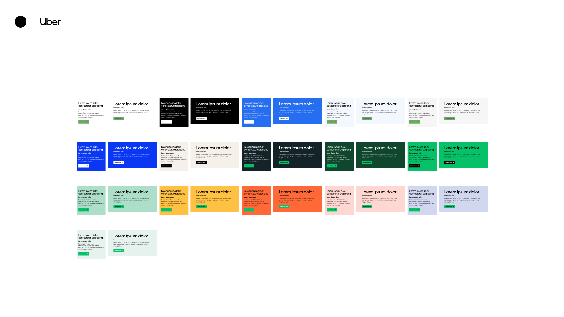
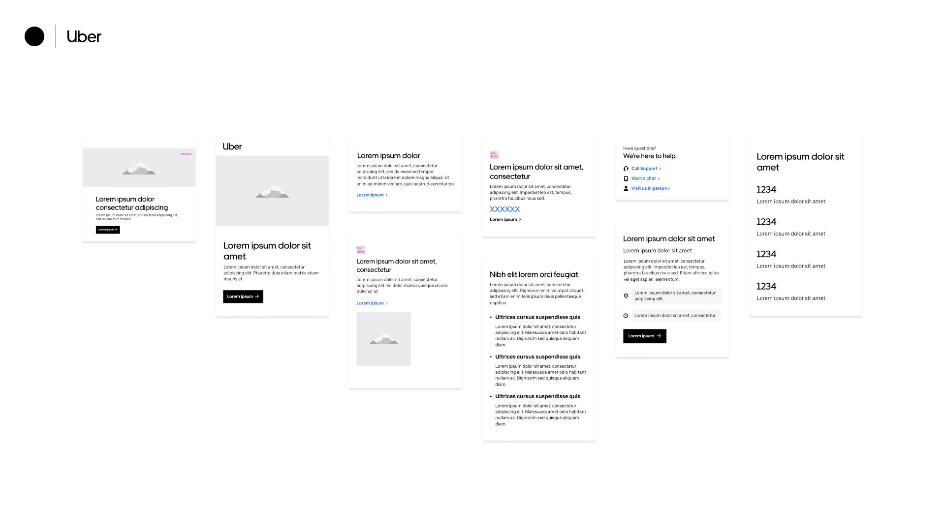
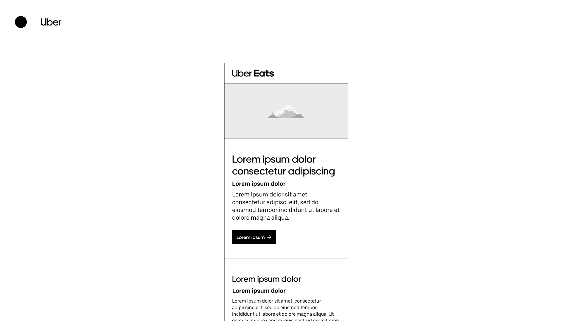
Uber's email system uses a series of modules that can be pieced together like legos in a self-service CMS, similar to web building products such as Squarespace.
Application of
Color
Applying the palette to the framework.
Accessibility
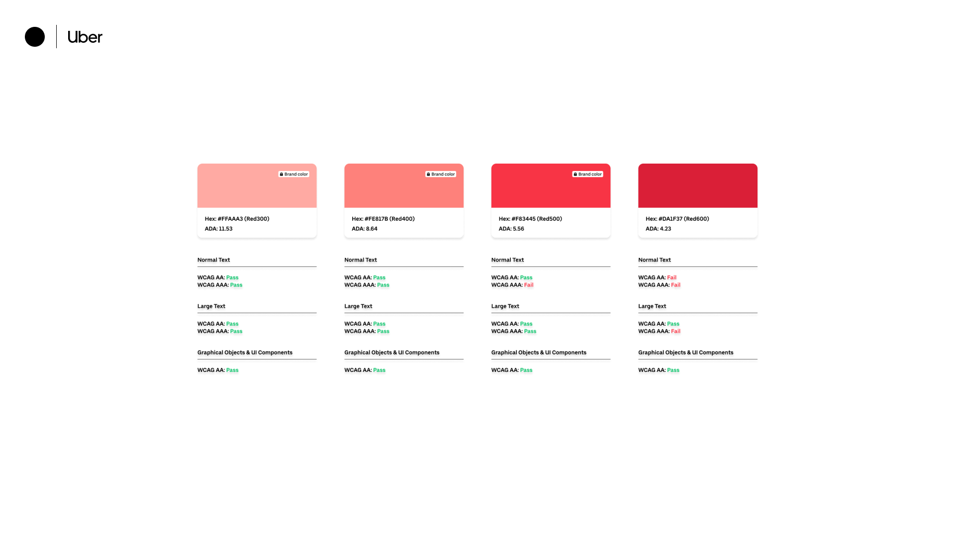
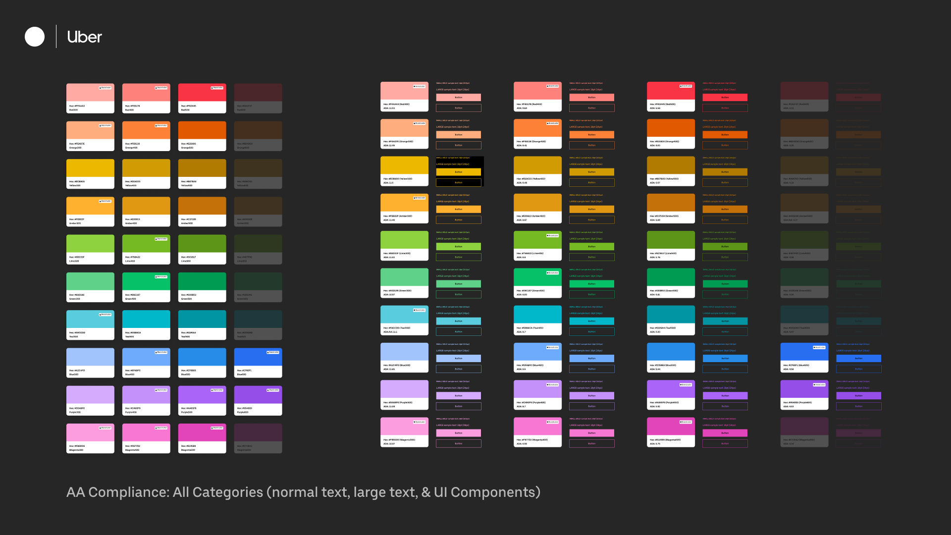
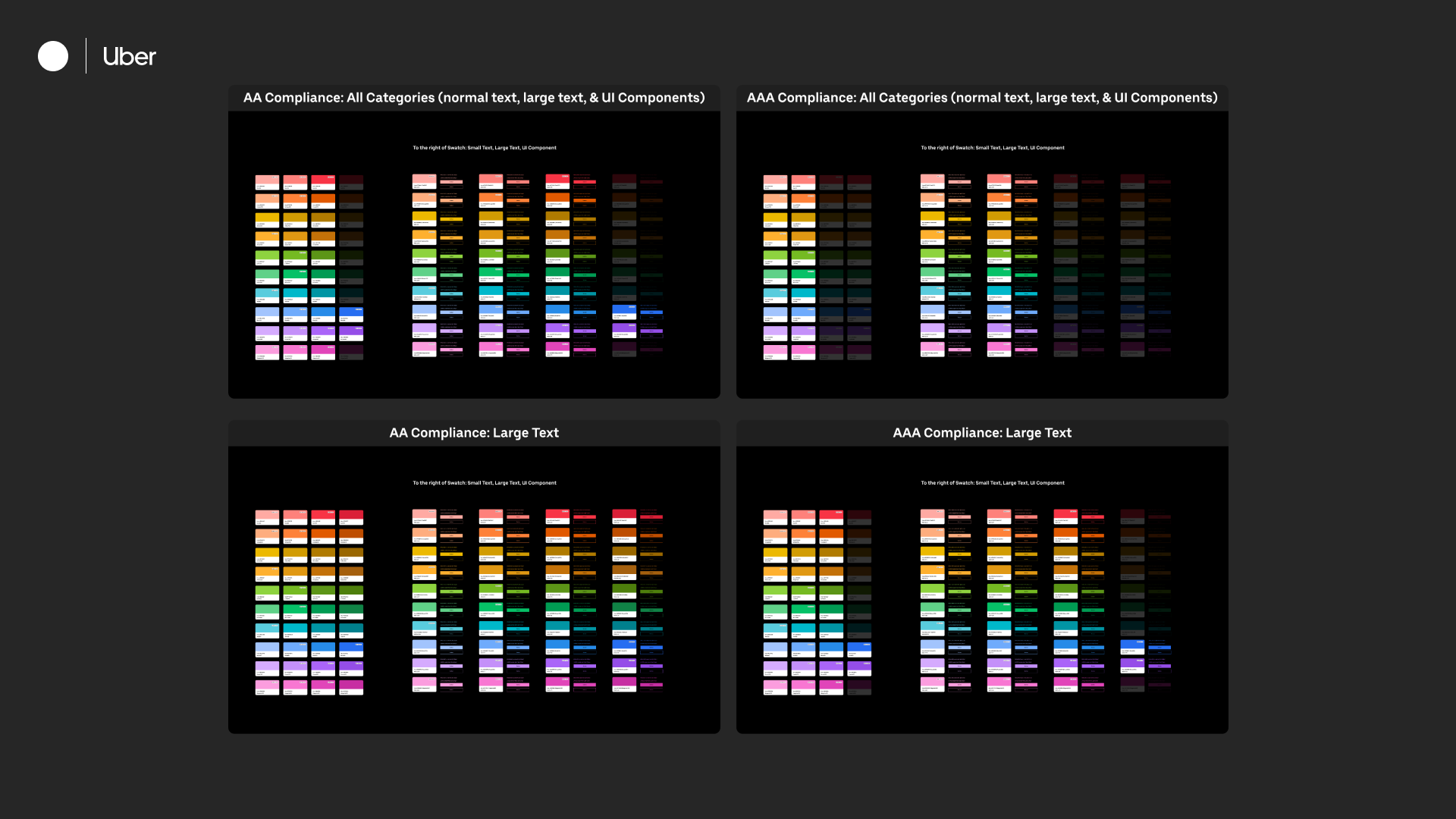
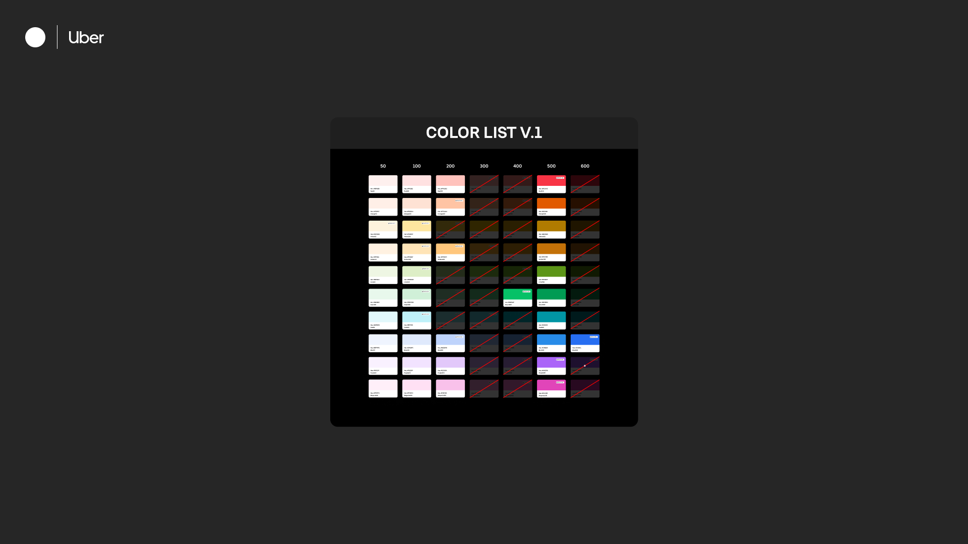
Before diving into the actual application of the palette, I conducted an analysis of all colors and created a sub-palette that was AAA compliant for emails. I collaborated with product and brand to find overlap between their ecosystems and ensure that the new selections would be consistent with Uber's voice.
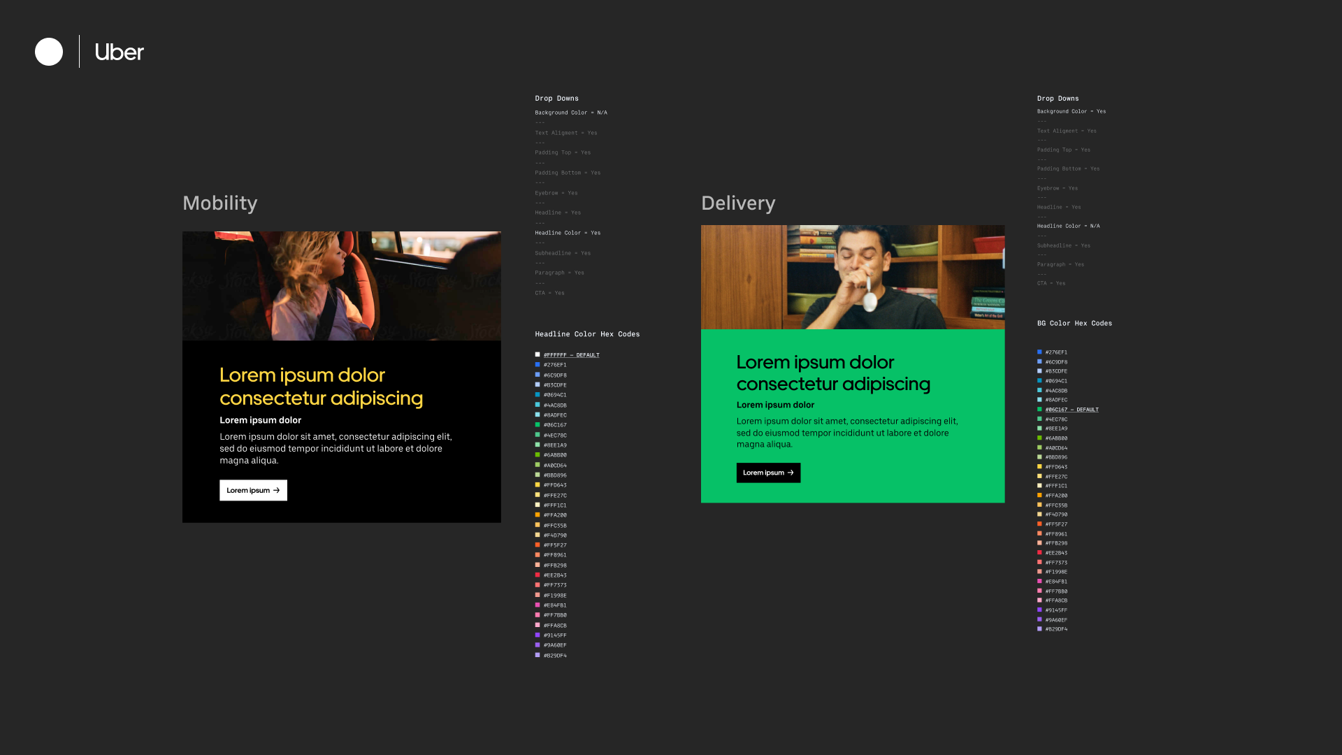
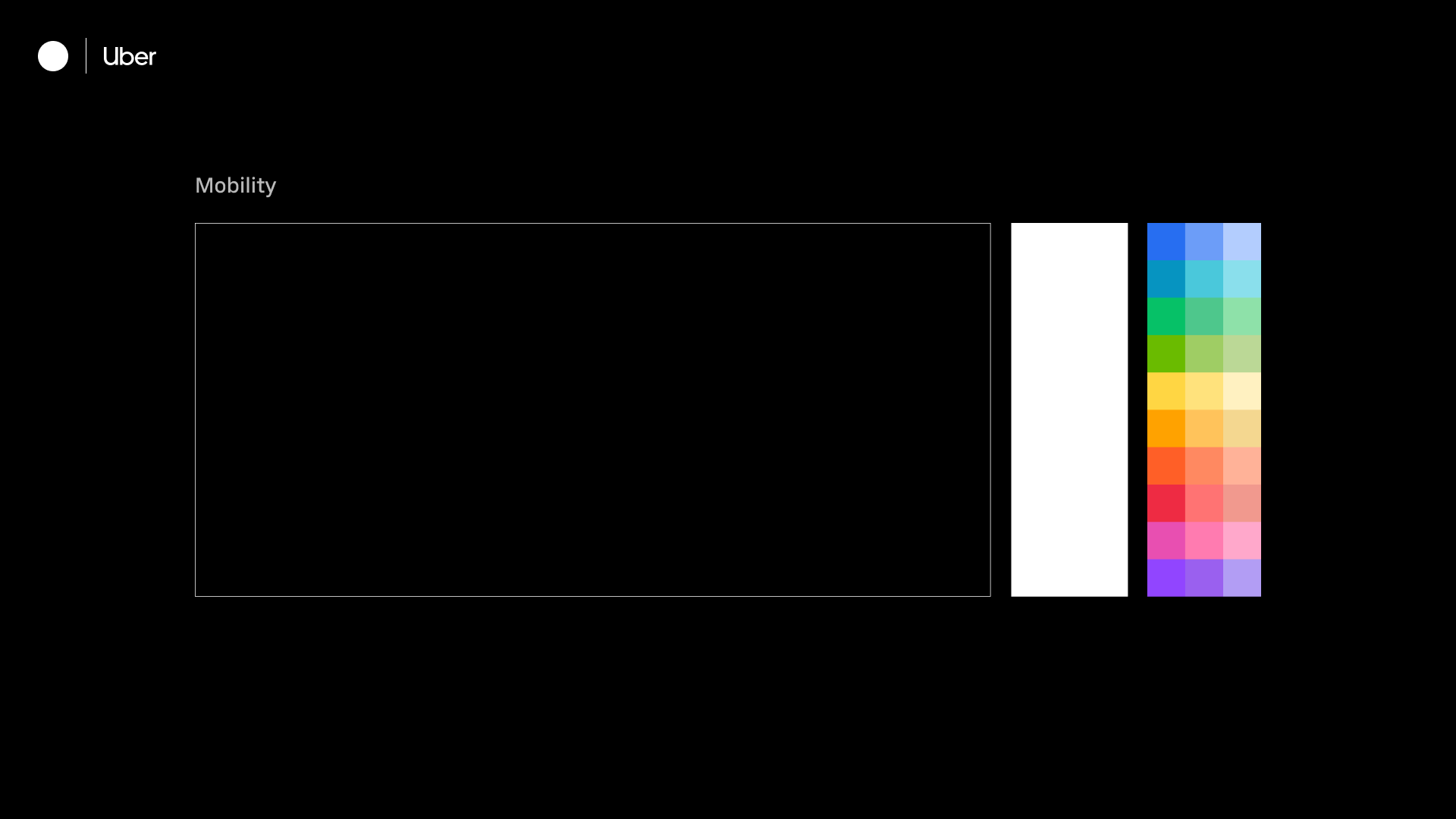
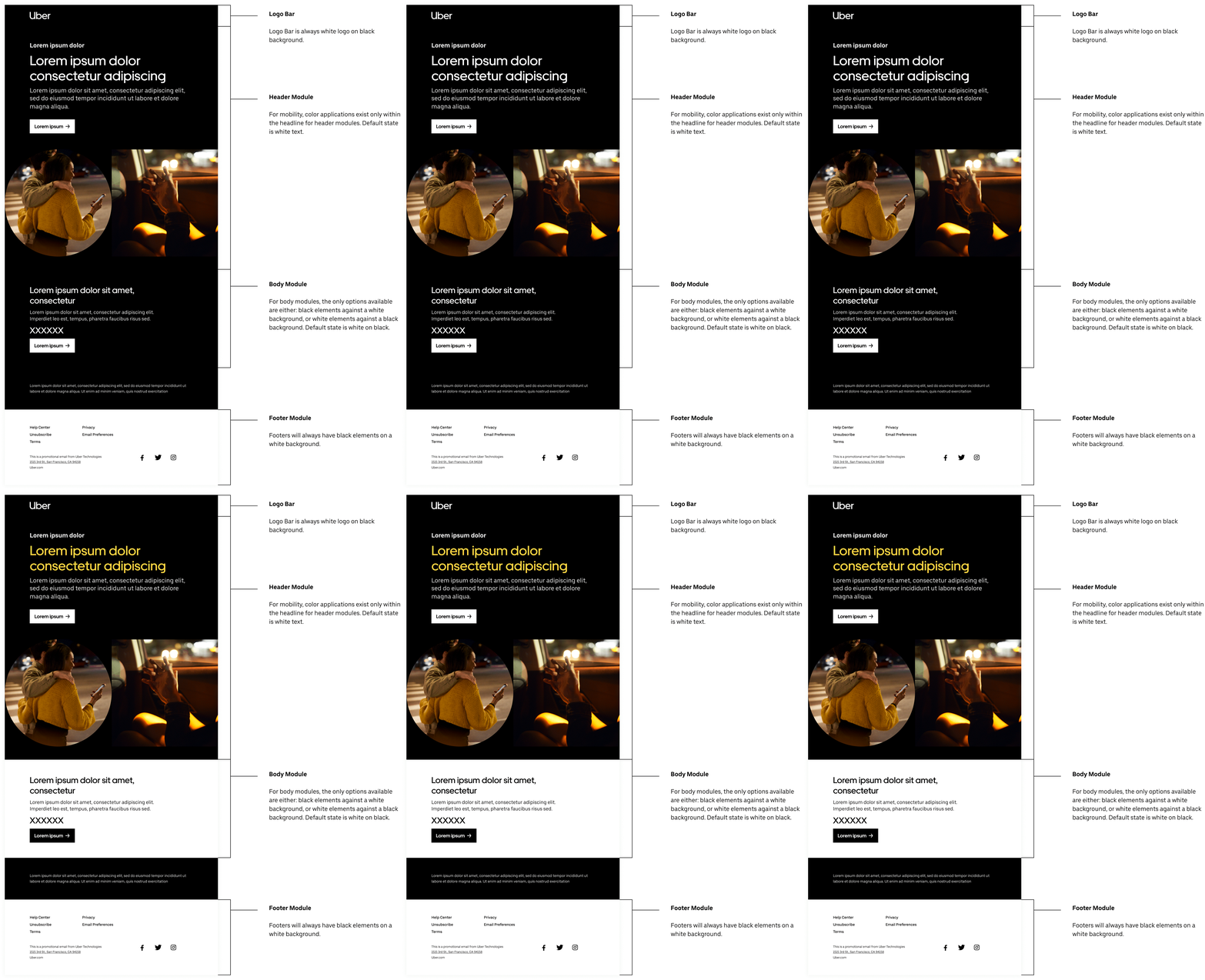
Mobility
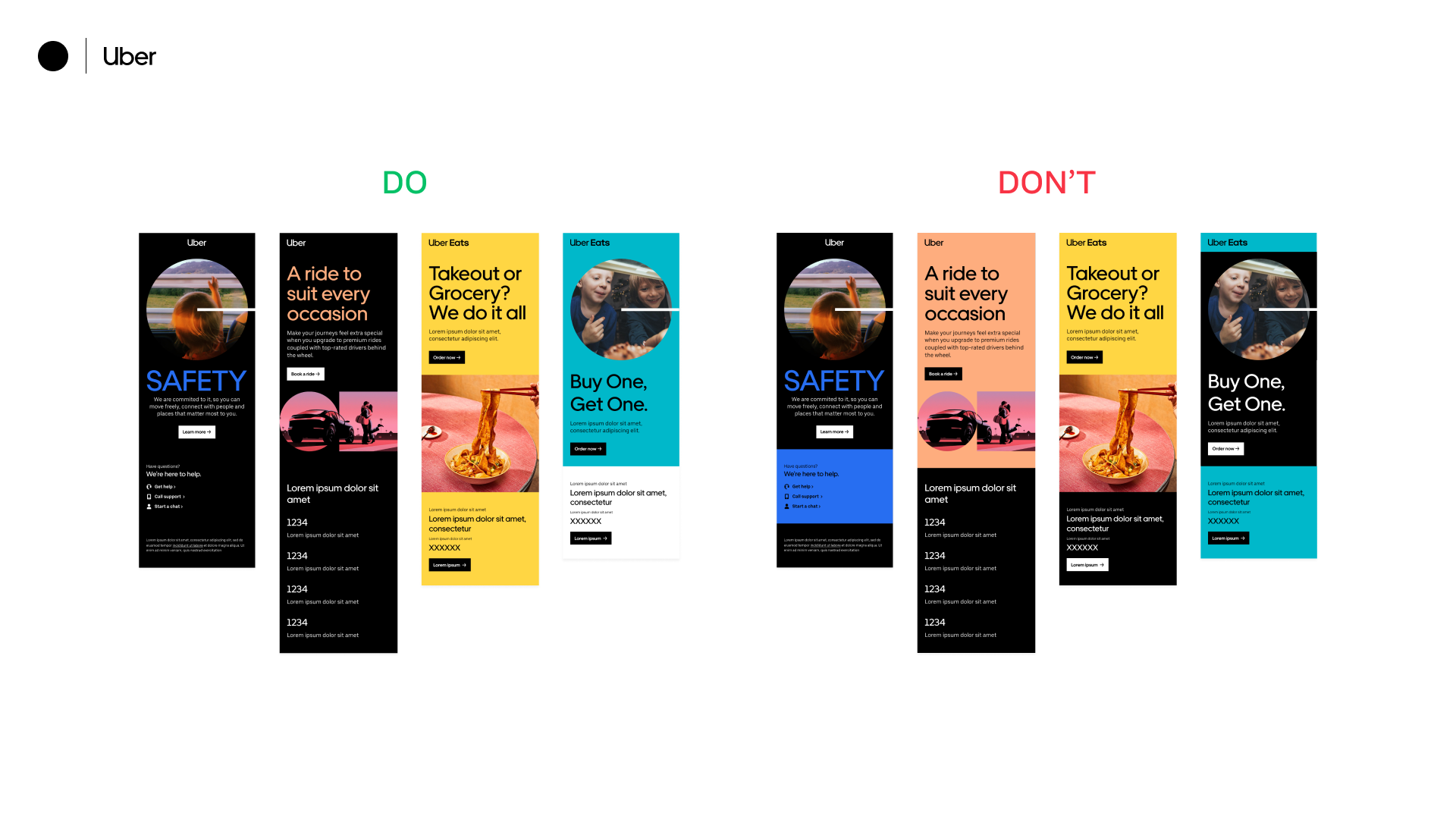
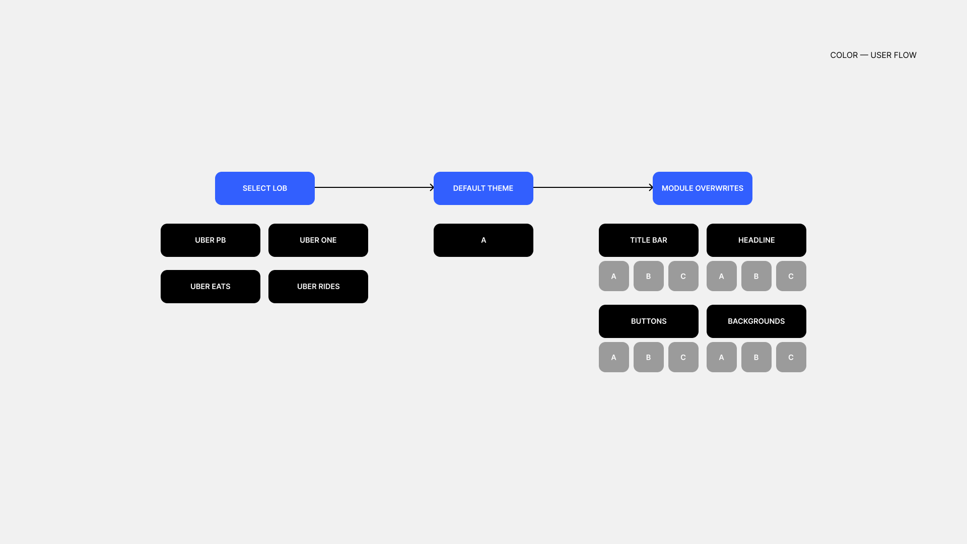
Mobility utilizes a black background with white elements on top. Any form of color application is used within the headline of hero modules. By default, modules will have white elements against a black background.
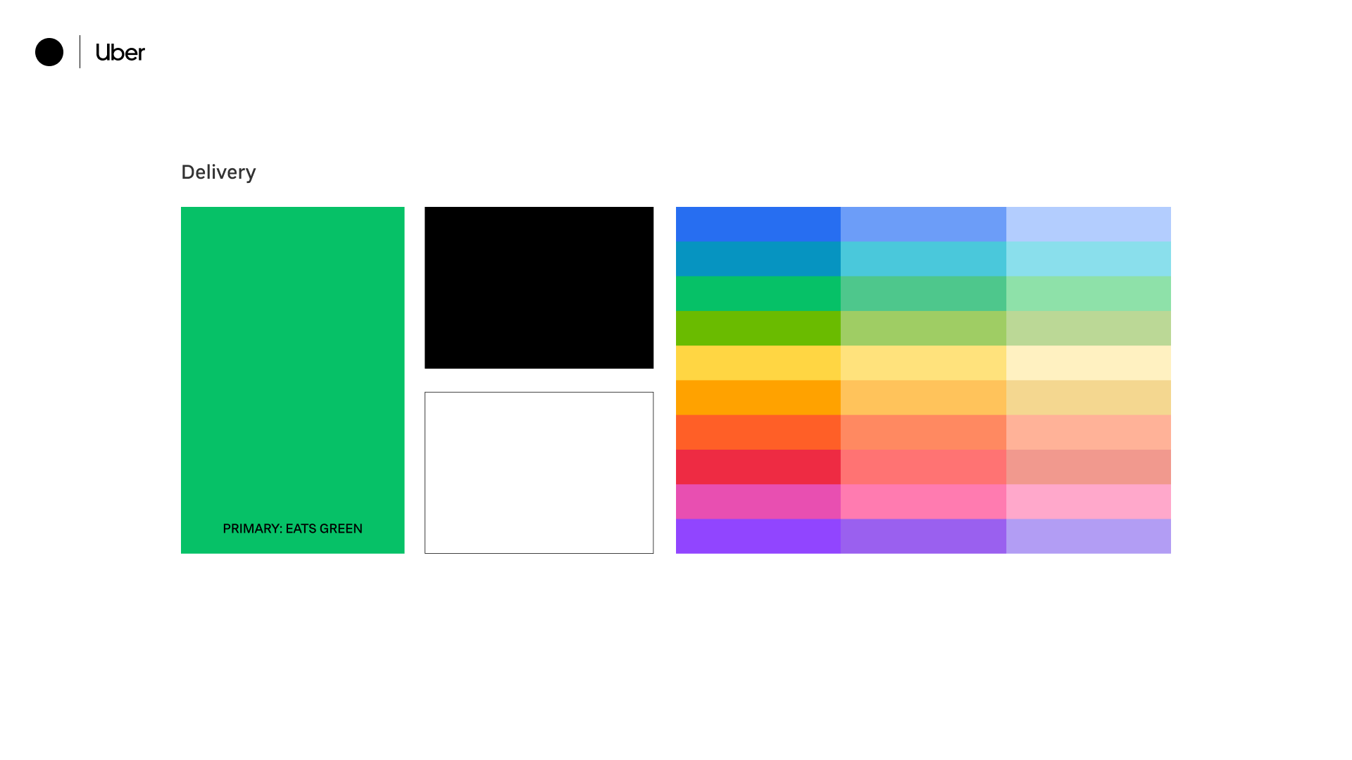
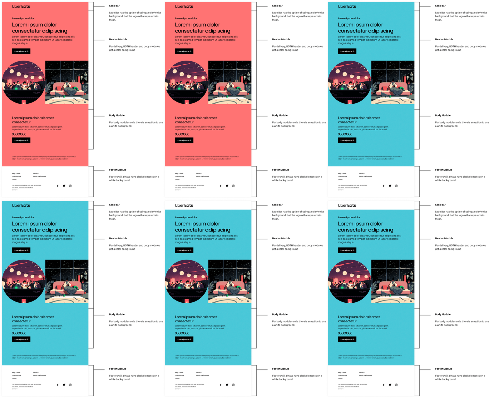
Delivery
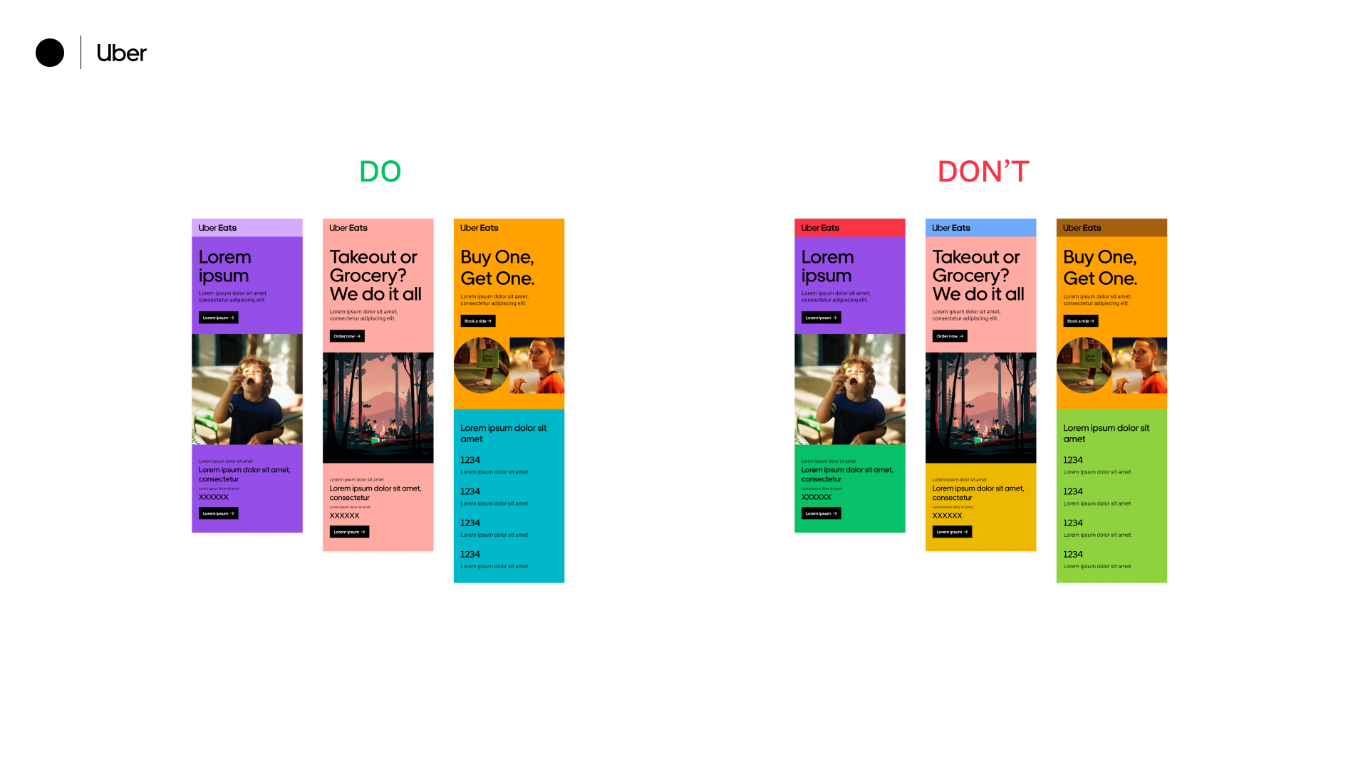
Delivery utilizes black elements on top of a color background. Compared to Mobility modules, ALL delivery modules (not just hero modules) have this same color treatment. A black background is NOT available as it is mobility-specific. By default, modules will have black elements against the Uber Green background.
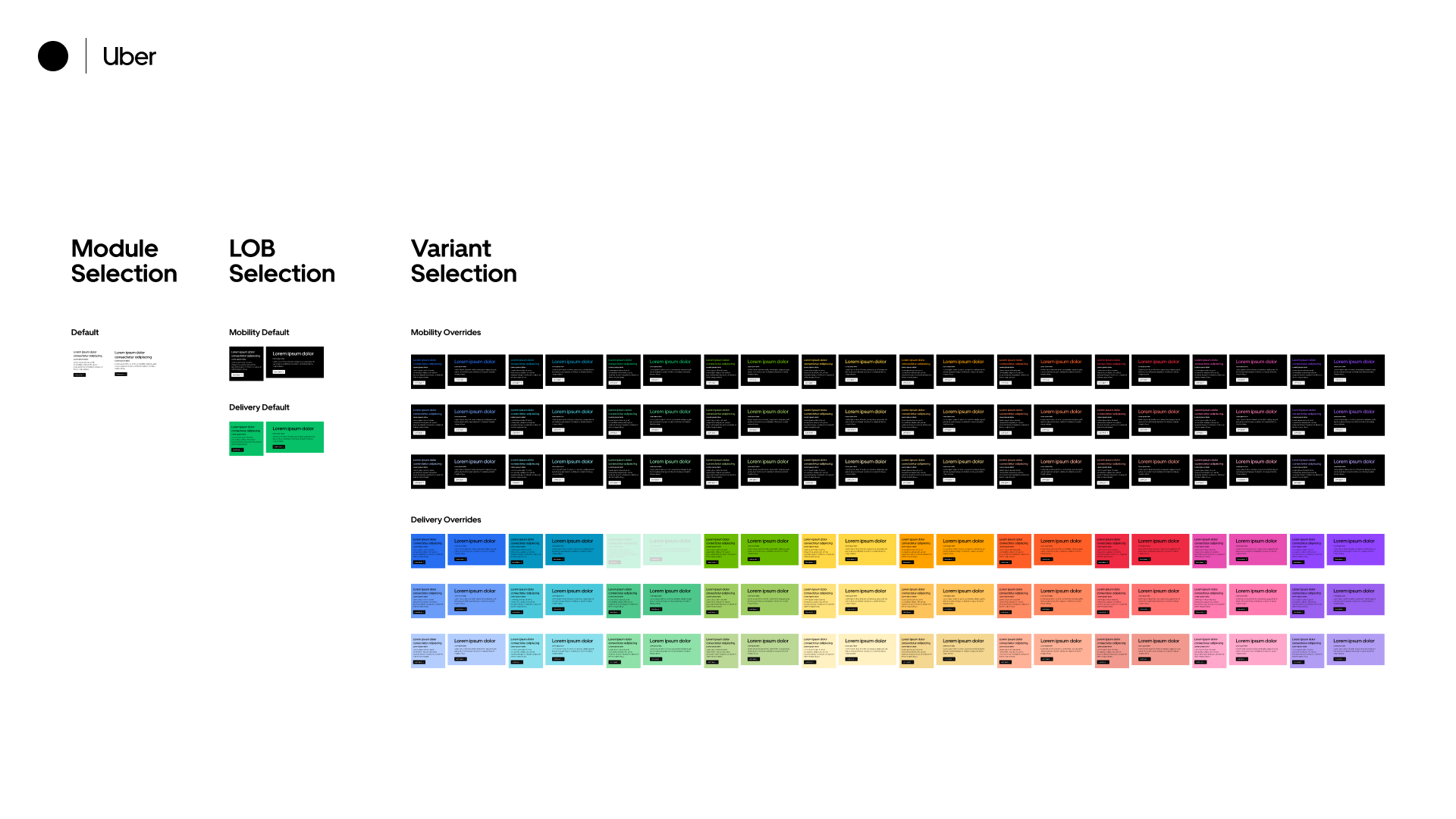
Systemizing the Process
This color logic was then applied to all existing modules through a top-bottom process. I worked with the dev team to implement everything into the CMS system; an in-depth guideline of how to properly build out these new emails was also created as an internal webpage.
